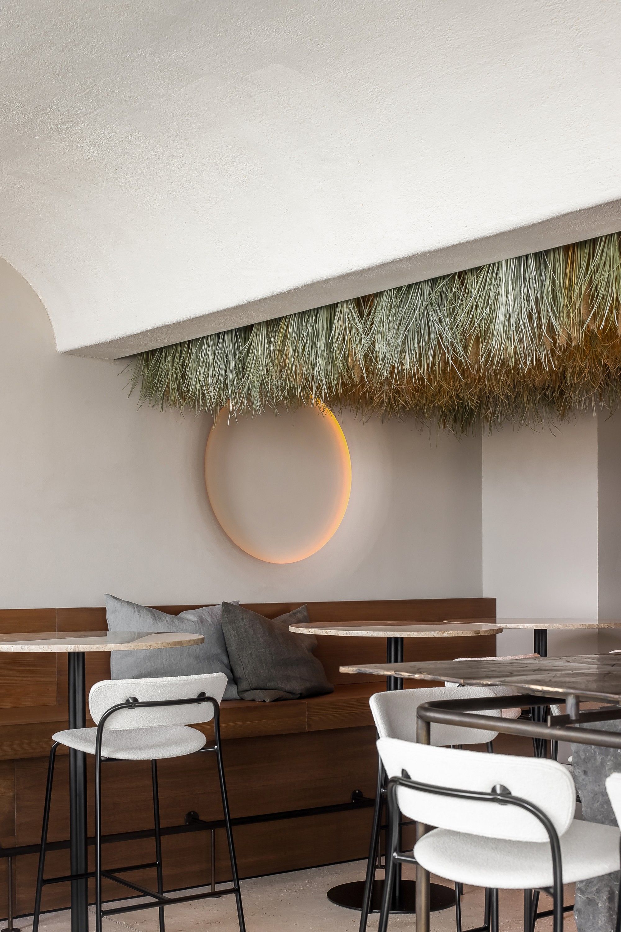
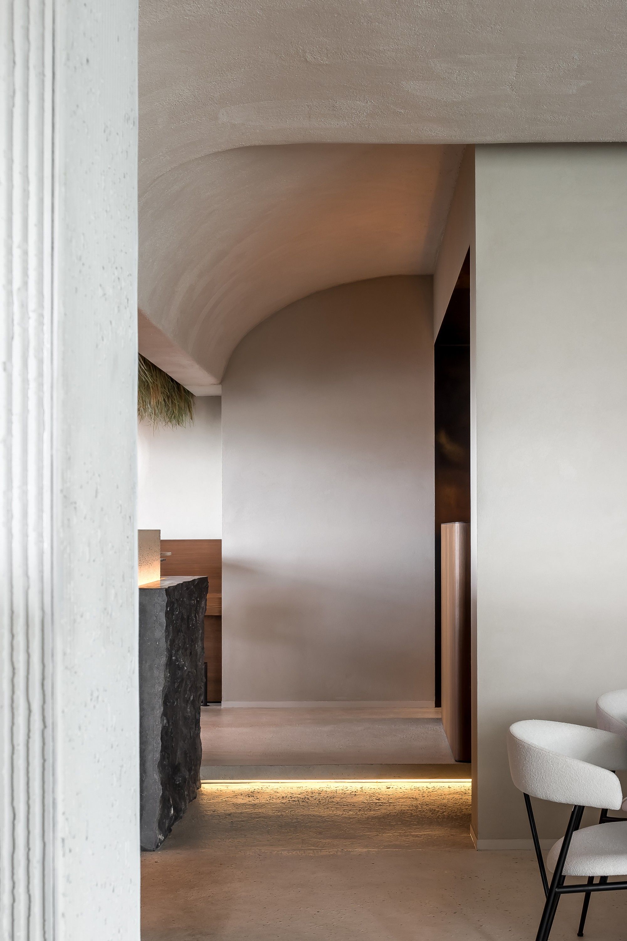
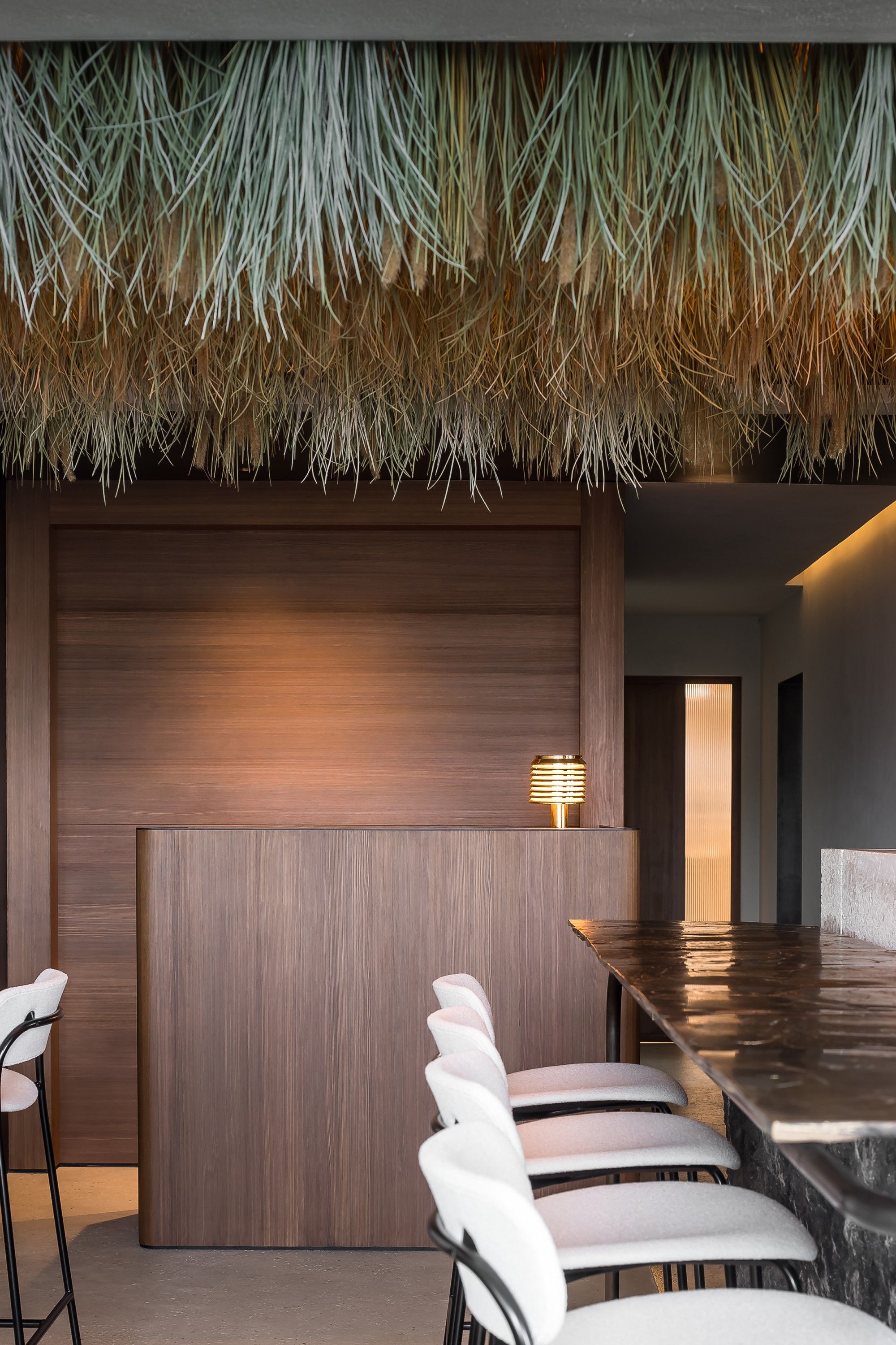
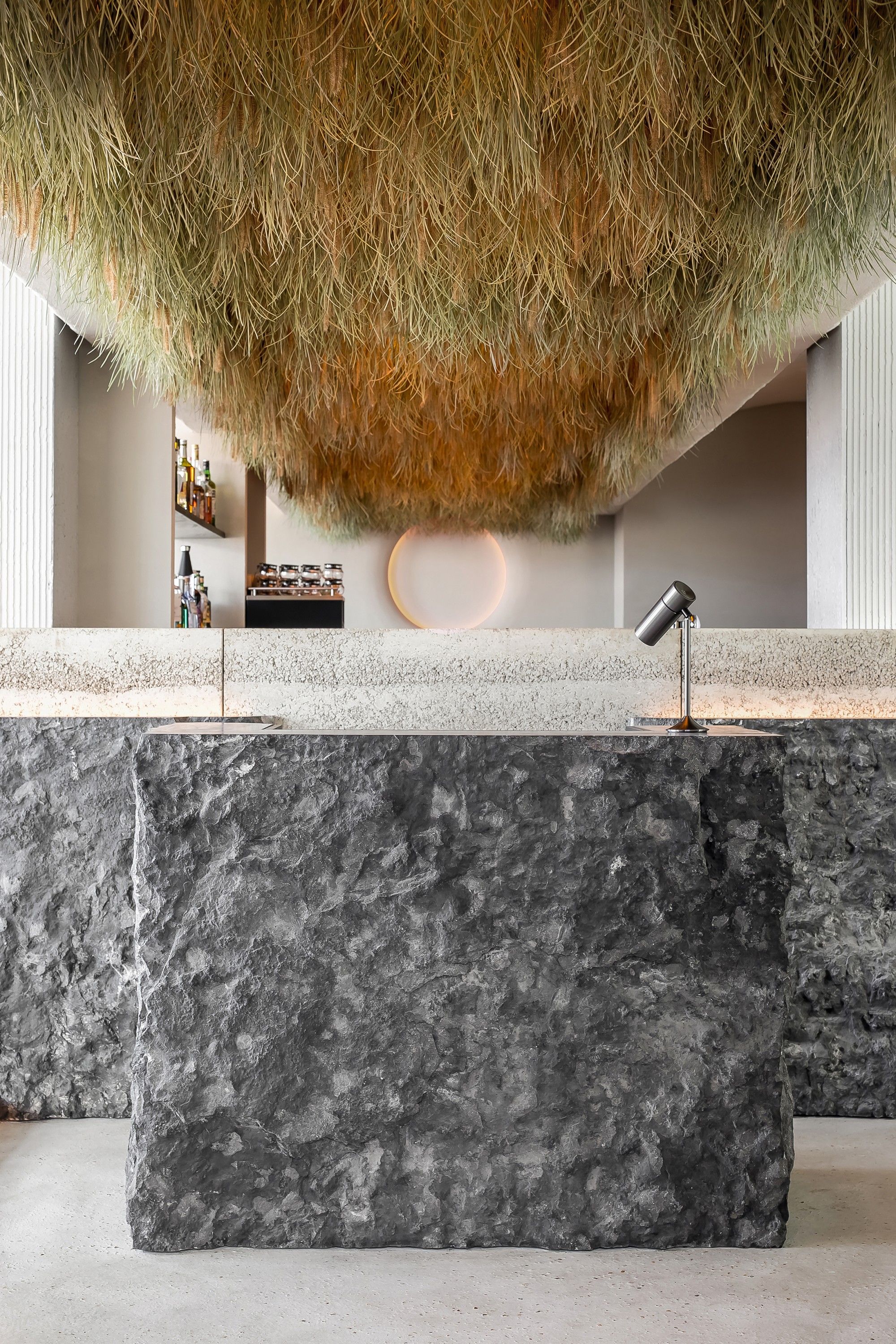
Between the dyke and the dunes of Duinbergen near Knokke-Heist (BE) lies the new restaurant Dunas. The interior was designed by Grain Designoffice. Thanks to the captivating, tactile mix of natural materials and colours, the Belgian interior architect agency perfectly captured the soul of the North Sea. Think organically shaped benches made of prefabricated stamped concrete, a floor in which shell fragments were subtly incorporated, a broadloom storm carpet by Pierre Frey and details in weathered brass and copper. A special feature is the entrance with reception desk in Belgian bluestone, a ceiling from which dune grass grows and lighting reminiscent of the setting sun.

Grain Designoffice translates sea and dunes at restaurant Dunas
If we wanted to catch the essence of the interior of the new Dunas restaurant in a nutshell, we would start telling you about the prefabricated rammed concrete benches with soft cushions in organic shapes. It looks like the wind has blown and shaped them against the wall. A little further on, thanks to the stylised, undulating movements in the walls and ceiling, you take a dive underwater. In turn, the durable, European larch pine and details in weathered brass and copper make you think about ships that have weathered a storm or two. It is clear that Grain Designoffice took its inspiration from the North Sea for the design of restaurant Dunas. In fact, the entire interior reads like an exercise in translating the surroundings into the interior. With Dunas' location on the boundary between water and shore, this should come as no surprise.
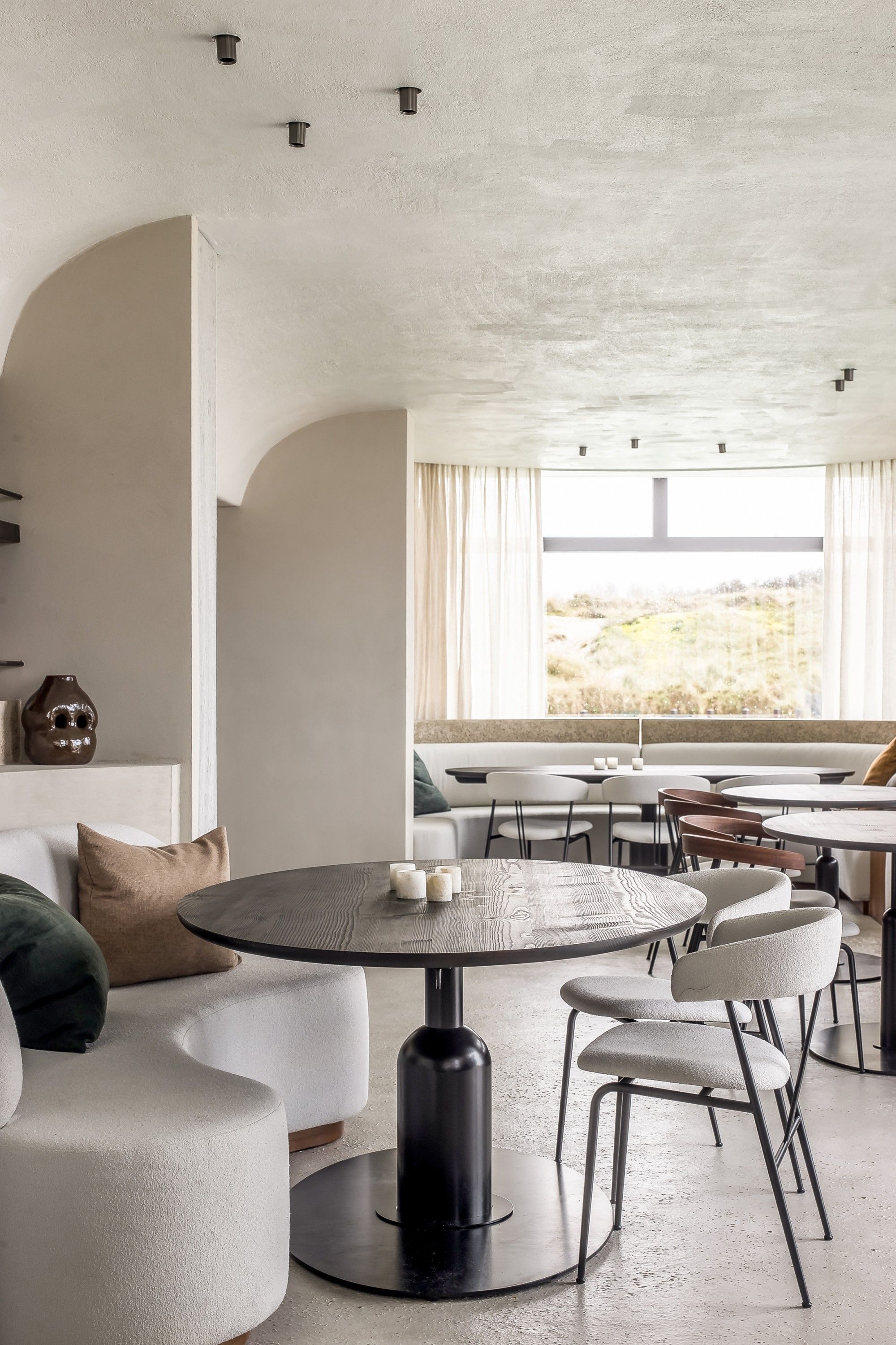
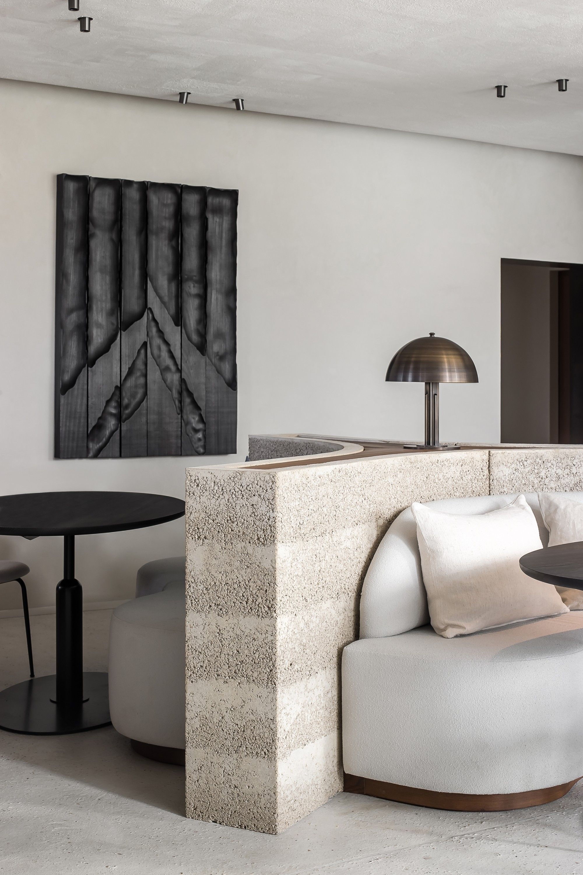
Every colour also finds its origin at sea. From stormy deep blues and greys to greens and beiges reminiscent of soft summer days. A great example is Verilin's transparent, sand-coloured curtains with blue colour dégradé. The interior is serene, but at the same time manages to surprise with some unexpected twists. A concrete back wall curves around a cluster of benches, creating a sense of intimacy and security while dining. It stands in stark contrast to the open bar in the centre of the restaurant that serves not only guests, but also passers-by who pop in for a quick aperitif.
Puzzle of organisation and concept
In the room, the overview of the space is complete. It clarifies the balance between open and closed spaces, between high and low seating comfort and between soft and rough textures. The short walkways between the kitchen and the hall are also a grateful element in the restaurant's practical layout. The acoustic plastering of the ceiling benefits the restaurant experience both aesthetically and functionally. The puzzle of organisation and concept, of aesthetics and the flow of a restaurant is one that the team at Grain Designoffice enjoys solving. Finally, at the owner's request, the entire space was topped with a cosmopolitan sauce. The playlist and the DJ booth with a vintage light by Hans-Agne Jakobsson is the icing on the cake.
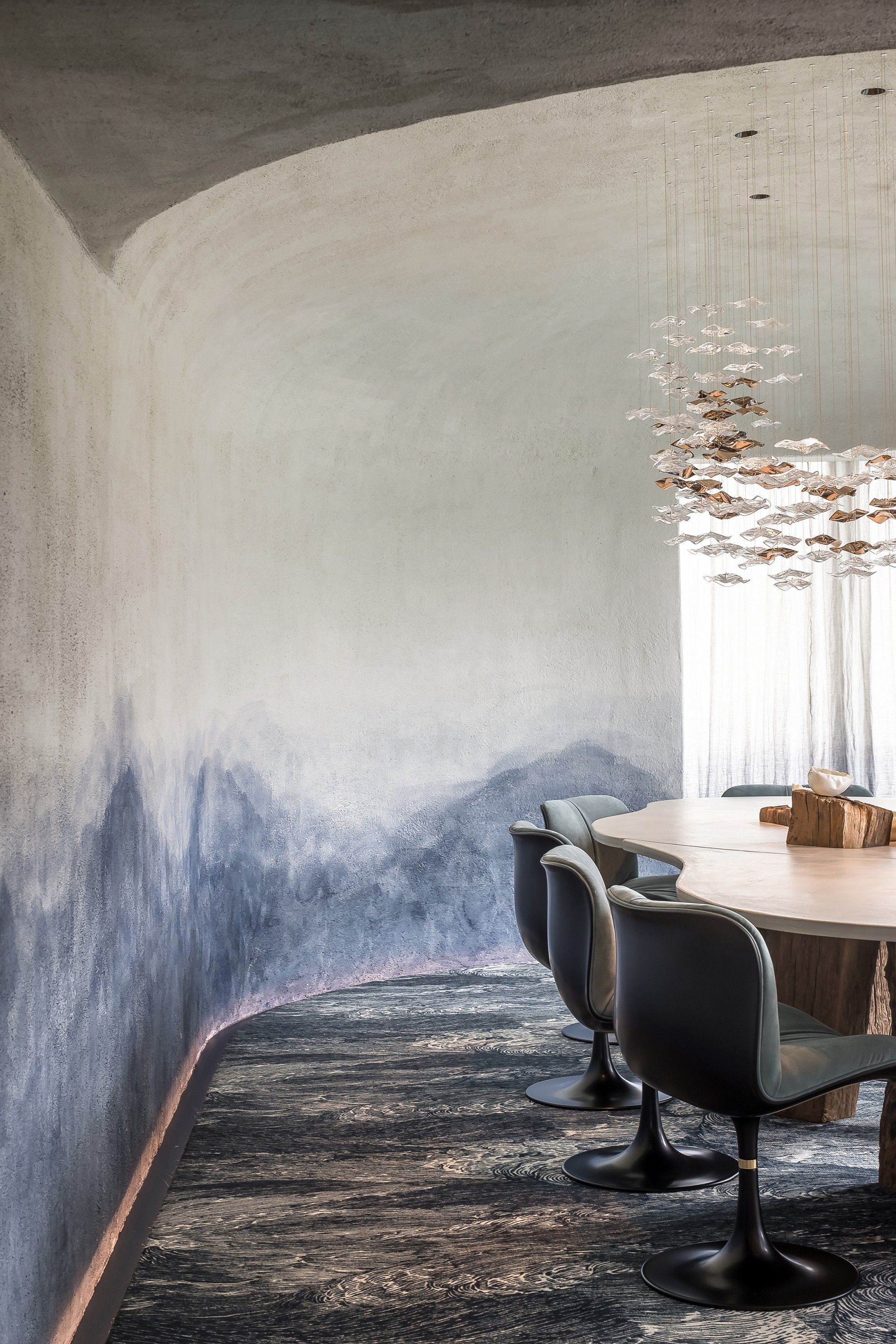
The result is a restaurant that not only indulges in culinary delights, but also serves a unique everlasting experience. And that starts already at the entrance. Whoever enters the restaurant is led through the sober and restrained entrance hall into the new spatial experience of Dunas. Once the doors slide open, you notice the reception desk in Belgian bluestone and a luminous ceiling from which dune grass grows. The whole is flanked by a circular lighting fixture the team developed themselves, reminiscent of the setting sun. Indeed, the colour of the lamp indirectly emits changes with the passing of the day; from warm white in the morning to orange-red in the evening. In the private dining area, Grain Designoffice's statement is fully expressed. With acoustic plastering from ceiling to floor, an artistic wall-to-wall carpet by Pierre Frey, a chandelier by Haberdashery that shines like the sun on the waves and a table made by Grain with lake poles as legs, you almost literally step into the North Sea. Luckily you won't get your feet wet, but you will have a warm heart for this exceptional place on the Belgian coast.
Restaurant Dunas opened its doors in November 2022. You can join chef Fran Mertens there for casual fine dining in a gourmet setting.
About Grain Designoffice
Belgian interior architecture firm Grain Designoffice was founded in 2016 by Sander Bullynck and Nick De Moor. The duo's realisations range from residential homes over interior architecture for property developments to hospitality projects. Their portfolio is characterised by the powerful combination of textures and volumes, by the captivating contrast between roughness and refinement and by the timeless simplicity that Bullynck and De Moor always manage to achieve. In hospitality, they find the challenge of seamlessly reconciling aesthetics and practical flow and derive satisfaction from conceptual thinking. The results are hospitality projects that excel in experience and remain memorable thanks to their unique and special atmosphere.
Photography: Cafeine.
Header: Michiel Vergauwe.
SAVVY x Grain Designoffice: international press & PR / social media coaching.
Find our other cases here.